There’s a reason a beautifully appointed room can stop you at the doorway. More often than not, it isn’t the sofa or the chandelier doing the work — it’s the windows. The way a drape falls, the way a shade meets a sill, the way light is shaped before it ever reaches the floor. High-end window treatments don’t announce themselves. They make everything else in the room look better.
So what separates a window treatment that looks expensive from one that was just expensive? After years of measuring, fabricating, and installing in homes across the spectrum, we’ve found the difference rarely comes down to the price tag on the fabric. It comes down to a handful of decisions, most of them invisible until they’re wrong.
Here’s what we’ve learned about the details that separate a refined window from a forgettable one.
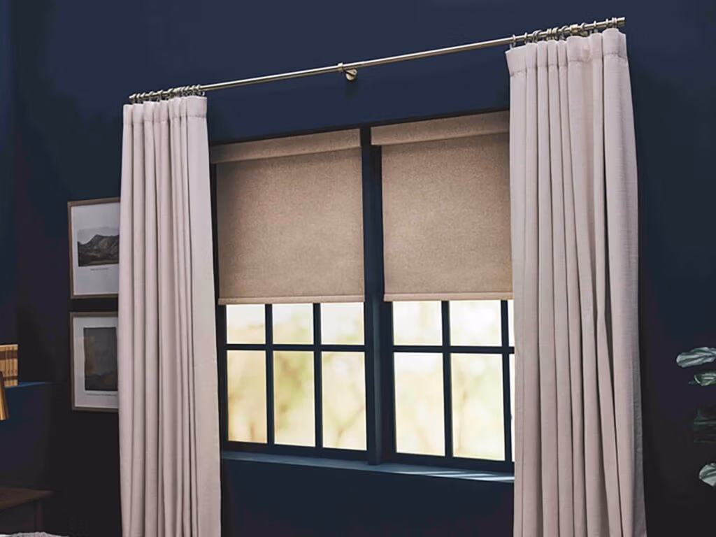
Generous, Honest Proportions
The single most common reason window treatments look cheap has nothing to do with the materials. It’s that they’re too small. Stock-sized panels hung tightly to the window frame, blinds cut precisely to the glass opening, valances barely wide enough to clear the trim; these proportions read as builder-grade no matter what the fabric costs.
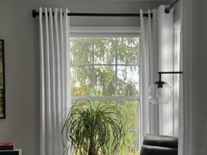
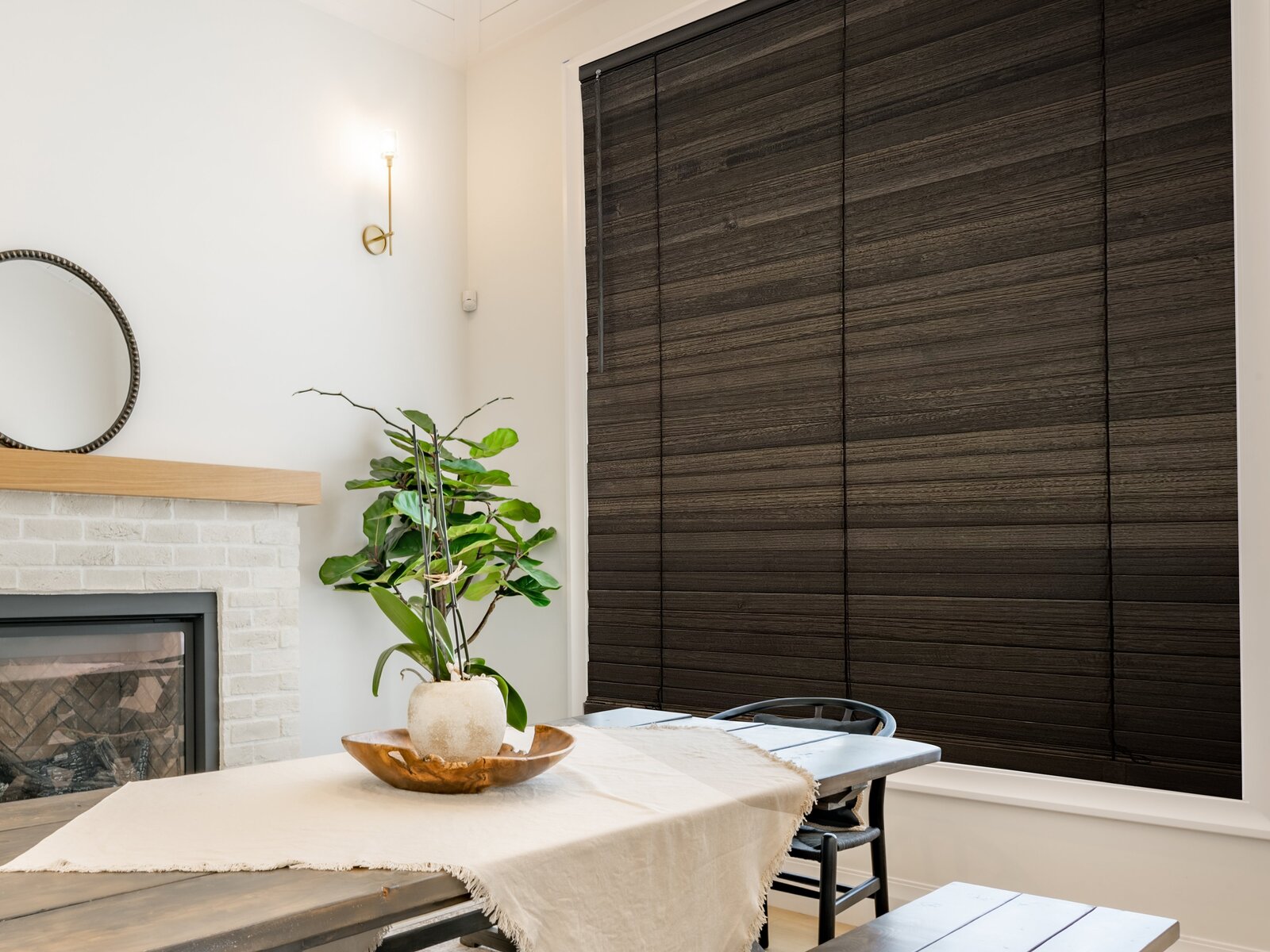
Refined window treatments are sized to the wall, not the window. Drapery rods extend six to twelve inches beyond the frame on each side, allowing panels to stack off the glass when open. Rods are mounted high, often just below the ceiling line, drawing the eye upward and making rooms feel taller than they measure. Drapery panels themselves are cut at two to two-and-a-half times the rod width, so the fabric falls in soft, deep folds rather than stretching flat across the window.
Shades and blinds follow the same logic in reverse: when an outside-mount is appropriate, we extend the headrail beyond the casing to conceal the hardware and visually enlarge the window. Small adjustments, but they’re the difference between a window that feels apologetic and one that feels considered.
The Right Fabric, in the Right Weight
Fabric is where most of the visible quality lives, but the rule isn’t simply “more expensive equals better.” A treatment looks high-end when the fabric’s weight, weave, and hand match the window’s function.
For drapery, weight is what gives the panel authority. Lightweight cottons and thin synthetics flutter and crumple. A medium-to-heavy linen, a textured wool blend, or a substantial velvet falls in clean vertical lines and holds its shape between cleanings. Even a sheer, when chosen well, has body, a difference between a curtain that drifts and one that drapes.
A few honest tells of fabric quality:
- The hand: a refined fabric feels substantial when it falls through your fingers, not papery or slick.
- The selvedge: clean, woven edges suggest a mill that takes finishing seriously.
- The drape test: pinched at one corner and lifted, quality fabric forms soft S-curves rather than stiff angles or limp folds.
- The light test: held against a window, the weave should be even, with no thin spots or printing irregularities.
A high-end window doesn’t shout. It does its job so well that the eye moves on, satisfied, to the rest of the room.
Lined, Always Lined
If we could change one thing about how most homes are dressed, it would be this: line the drapery. A proper lining and an interlining where the fabric or climate calls for it is the single most transformative upgrade you can make to any panel.
Lining gives the drapery body, so it falls properly instead of pressing against the window like a bedsheet. It protects the face fabric from sun damage and condensation, dramatically extending the life of the treatment. From the street, it gives every window in the house a uniform appearance regardless of what color or pattern lives on the inside. And in the room, it adds the soft, weighted movement that telegraphs custom from across the space.
Interlining a soft flannel layer between the face fabric and the lining is the secret behind hotel-grade drapery. It thickens the panel, deepens the folds, and gives the treatment that quietly luxurious column-of-fabric look you can’t quite put your finger on but always recognize.
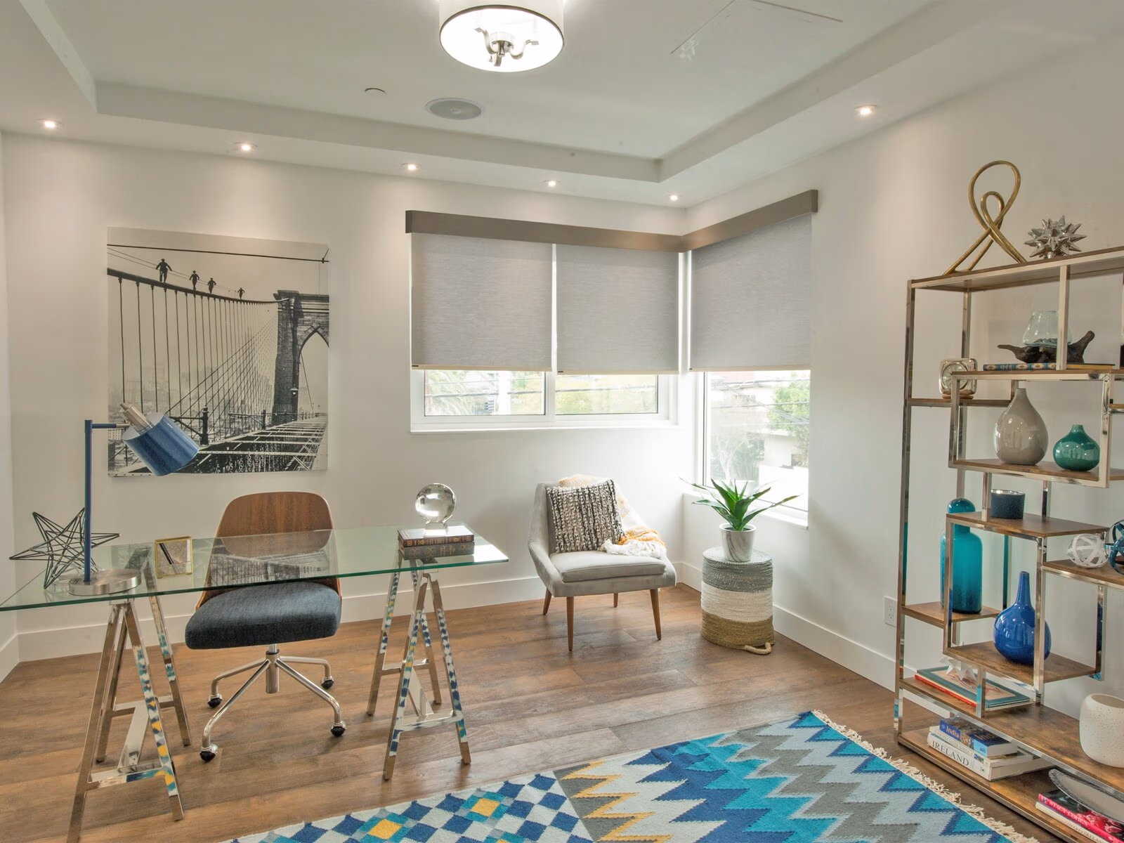
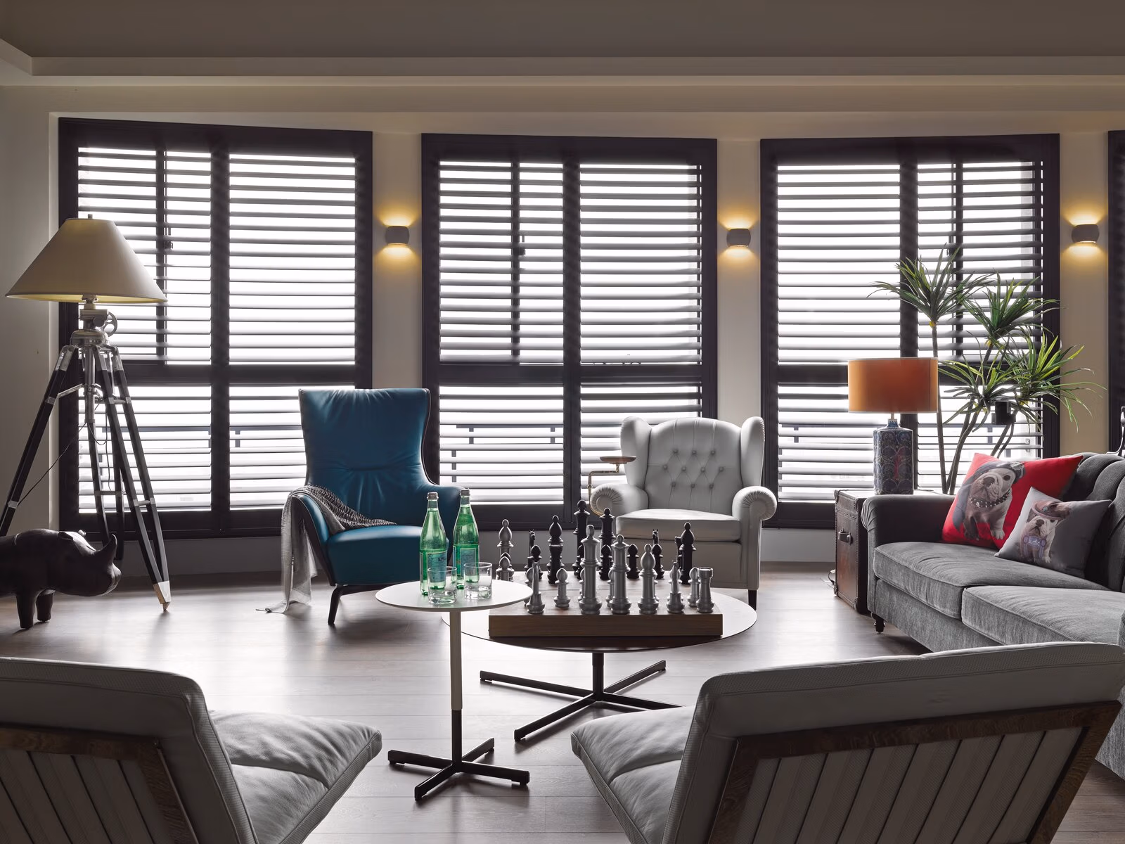
Hardware That Belongs to the House
Hardware is the jewelry of a window treatment, and like jewelry, it’s most effective when it’s chosen with restraint. Thin, undersized rods with ornate plastic finials are an immediate giveaway. So is hardware that fights the architecture of the room, gilded baroque finials in a clean modern interior, or stark black industrial brackets on a softly traditional window.
The high-end approach is simpler than it sounds: choose hardware whose scale matches the fabric, whose finish matches the other metals already in the room, and whose profile matches the architectural vocabulary of the house. A solid metal rod in an oil-rubbed bronze or hand-finished brass, properly weighted to support the panel without sagging, will outperform a more decorative piece every time.
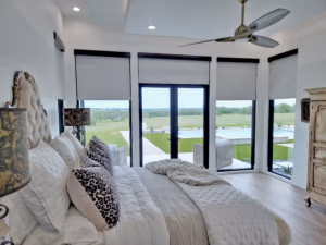
The same principle applies to shade and blind hardware. Concealed headrails, fabric-wrapped cassettes, and color-matched cord systems all signal a level of finish that off-the-shelf hardware simply can’t replicate.
A Custom Fit to the Inch
You can spot a stock window treatment from across the room. The shade hangs slightly crooked. There are unequal gaps of light along the sides. The hem grazes the floor unevenly or floats an inch above. Even the most expensive fabric, made to the wrong measurements, will read as inexpensive.
A custom fit is not just about ordering the right width. It’s about templating windows that aren’t quite square, and almost no windows are quite square. It’s about understanding whether the floor slopes, whether the casing is plumb, and whether the wall is straight enough to take a standard mounting. It’s about choosing between an inside mount and an outside mount based on what the window actually needs, not what’s cheapest to fabricate.
This is the part of the process that’s easiest to undervalue and impossible to fake. A measurement off by half an inch can mean a panel that won’t close, a shade that binds in its track, or a hem that puddles unintentionally. Done well, the fit should be invisible, every line crisp, every gap consistent, every break exactly where it was intended.
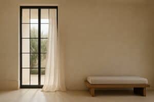
The Hem: Where to Land
Drapery hem length is one of those tiny decisions that quietly define how a room reads. There are essentially four choices, and each carries a different mood.
Floating:
The hem stops a quarter-inch above the floor. Crisp, practical, and ideal for high-traffic rooms or homes with pets. It reads tailored and modern when done with precision — but only if the floor is level and the measurement is exact.
Kissing:
The hem just brushes the floor, with no break. This is the most common high-end choice — clean, intentional, and forgiving of slight floor variation. It’s the safest place to land if you’re unsure.
Breaking:
The hem extends a half-inch to an inch onto the floor, creating a soft fold where it lands. Slightly more relaxed, and a beautiful match for heavier fabrics like velvet or wool that benefit from the added weight at the bottom.
Puddling:
An additional two to six inches of fabric pools on the floor. The most formal and the most opulent of the four, best for fixed panels in dining rooms, primary bedrooms, or any room where the drapery will rarely be moved. Done well, it’s stunning. Done poorly, it looks like a mistake.

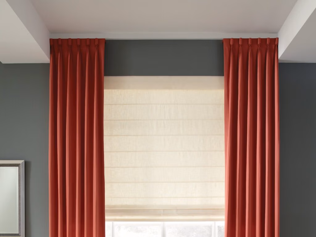
Layering, Thoughtfully
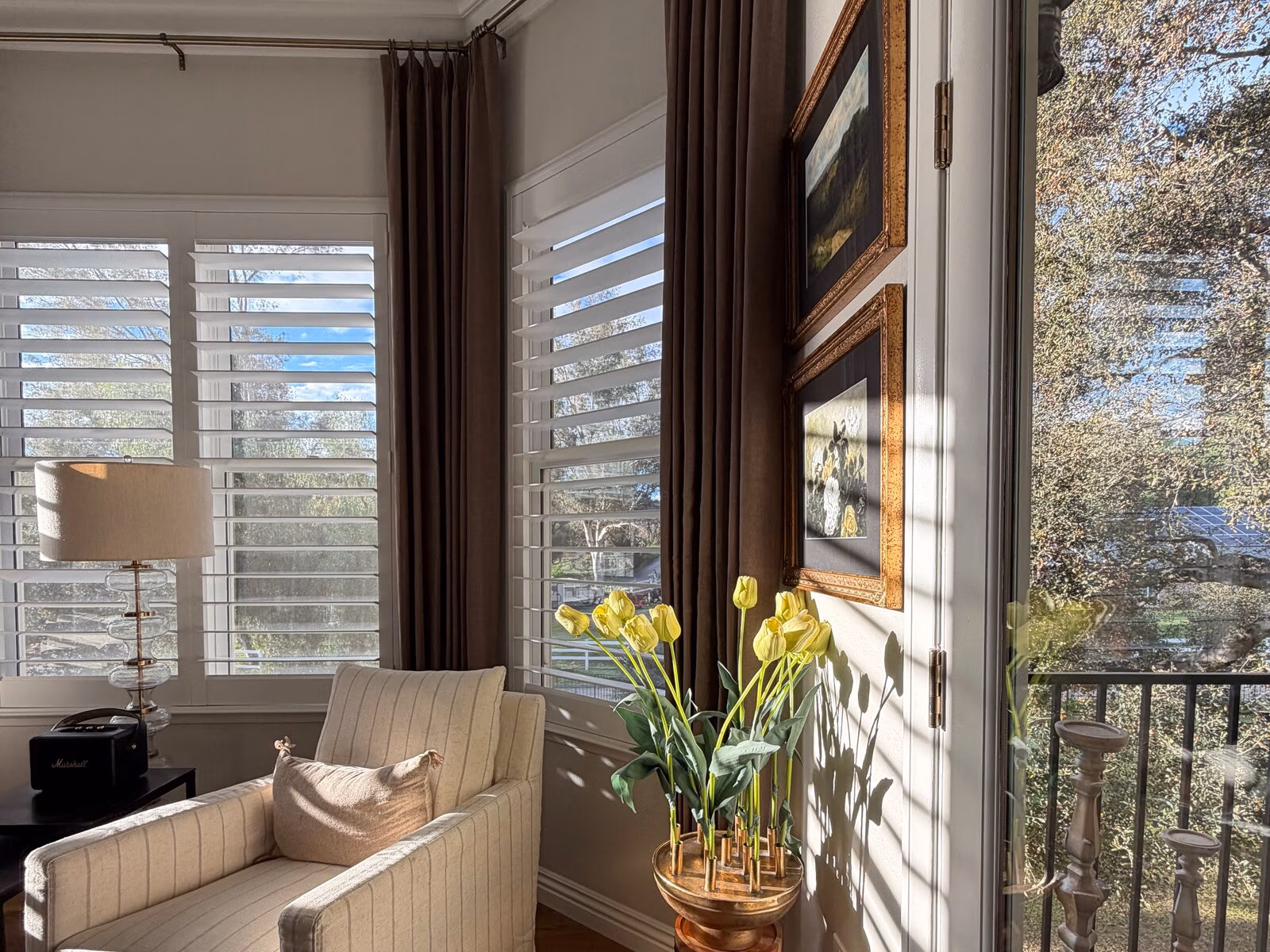
One of the clearest differences between a designer-finished window and a one-off purchase is the willingness to layer. A single shade does its job. A shade paired with stationary drapery panels or roller shades behind tailored Roman shades, or sheers behind heavier drapes, does several jobs at once, and looks dramatically more considered for it.
Layering allows you to control light by degrees rather than as a binary. It allows you to soften the hard edges of a window with a frame of fabric. And it allows the room to look complete from inside and from outside, rather than half-dressed.
The trick is to layer with intention. Two treatments should serve different functions — one for filtering light, one for blocking it; one for privacy, one for softness. When the layers are redundant, the window looks busy. When they’re complementary, the window looks finished
The Quiet Details: Operation and Finish
The last category of details is the hardest to photograph and the easiest to feel. It’s the smoothness with which a Roman shade lifts. The silence of a motorized roller. The way a drapery panel glides on its track without snagging. The crisp seams on the leading edge of a panel, the precise mitered corners on a Roman, the consistent pleat depth across an eight-foot drape.
These are the details that working with a professional workroom and a careful installer secures for you. They’re the details that separate a window treatment that was expensive from one that is still beautiful five years on.
None of the principles above requires an unlimited budget. They require attention to proportion, to fabric, to fit, to finish, and to the way light moves through a space at different hours of the day. Get those right, and even a modest treatment will look like it belongs in a much grander room.
That, in the end, is the real definition of high-end: a window treatment that makes the rest of the house look better, in a way no one can quite explain.